If I led growth at Navattic, here’s what I’d do…
I'm restarting my "build-up" series, where I share PLG ideas & experiment hypotheses for SaaS brands I admire.
The goal isn't to tear down their existing experience, but rather to build them up by thinking through ways they could improve. Building people up is one of my values.
Today, I'm building up Navattic.
And if you follow me, you know how bullish I am on ungated product experiences. I believe allowing users to use the product BEFORE filling any forms is a game changer for SaaS brands that enables them deliver more value - and activate more users.
I’ve personally seen these "try it before you sign up" experiences drive double-digit engagement rates for SaaS brands I've worked for.
Navattic makes software to help SaaS brands create these experiences. Which is great for the SaaS community. But, it creates some challenges for them to “dog-food” their own approach.
How do you create an interactive version of a product - that enables other companies to create interactive versions of their products 🤔
It's a weird challenge. Very meta.
They've chosen to solve it with an ungated interactive demo showcasing their tools with a product most teams are already familiar with - Google Analytics.
Here’s what their current homepage looks like, just beneath the hero section.
It looks slick and it definitely allows their website visitors to experience the core value of their tool.
I imagine this experience has strong engagement - probably upwards of 10-12% of visitors interact with it.
But, it's not perfect.
I believe their interactive demo can work even harder for them.
I suspect some visitors will be confused why Google Analytics is there - and struggle to connect the dots that it’s used as an example. That confusion might prevent some visitors from getting value from the interactive experience. Ultimately, stopping them from understanding how they might use the Navattic software at their company.
If I worked at Navattic, here’s what I’d test
The test would involve enabling Navattic website visitors to enter their product URL and create an interactive snapshot. Then letting those visitors use Navattic’s tools on their product snapshot, not Google’s.
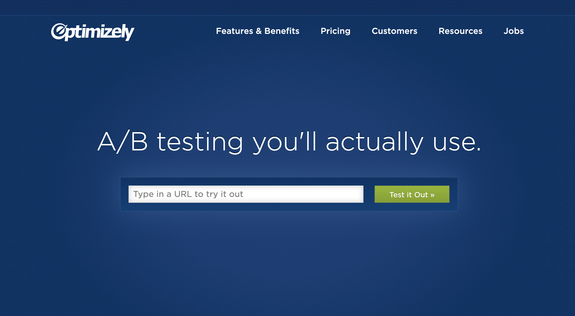
Like what Optimizely did back in 2015. Visitors could enter in their URL and Optimizely would load your website inside their wysiwyg editor. You could use Optimizely and set up your first test - totally ungated. Then they would prompt users to create an account before you could actually turn anything on.
After those website visitors have created their first interactive product experience using Navattics’s no-code editor and seen how easy it is to use - Navattic can prompt those users to continue with a CTA to get started. Say before users are able to share their interactive experience with anyone else.
My hypothesis is these changes should increase the quality of interactions.
The primary measure of success would be the number of people who clicked Navattic’s primary CTA, which is currently to “get a demo” on the test version compared to the original. But I’d also be interested to track the total interaction rate & collect qualitative feedback from users as well.
If my hypothesis was right, I would aim to increase the impact by making a few additional changes to their homepage:
Moving the interactive demo higher above the fold so they wouldn’t lose folks who didn’t scroll.
Removing everything but a short headline to minimize distractions and highlight the product. Something like:
"Hey, we're Navattic. We help SaaS brands build, customize, and share interactive product demos that convert. We could share all the reasons why customers love us, but we thought you'd rather see for yourself." With the embed directly under.
I'd plan to run this test for a few weeks before peeking at the data. If my hypothesis is right...they could see significantly more qualified demos.


